
7 Fluted Wall Panel Mistakes That Ruin the Look
2026-04-02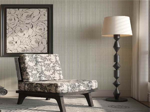
Fluted wall panels have gone way past being just a passing trend. They now serve as a favorite choice for TV walls, tall headboards, reception desks, and other main spots. These spots need texture but without a messy look. When you use them the right way, they bring a nice pattern, a play of light and dark, and a more complete built-in style to the room. When you use them the wrong way, they create the opposite effect. A wall might seem too crowded. A bedroom could feel chilly. And a reception desk might look smaller and less high-quality than it should.
That is why the real test is not whether to use a fluted wall panel. It is how you apply it with care. In homes and business spaces, the same seven errors keep showing up again and again. Some errors happen in the planning stage. Others appear during installation. At that point, small choices about size, light, edges, or color start to change the whole room.
This guide looks at the most common errors in fluted panel design. It covers TV feature walls, bedroom headboards, and reception desk fronts. It also gives practical ways to avoid them. For designers, builders, sellers, and buyers who work on modern interior wall decoration, these small details matter more than the panel itself.
Why Fluted Wall Panels Work in Modern Interiors
Before we get into the mistakes, it helps to understand why fluted wall panels have become so popular.
The vertical grooves create a light-and-shadow effect. Flat paint cannot do this. On a TV wall, that depth turns a plain media area into a main point. On a bedroom wall, it adds warmth and texture behind the bed. On a reception desk, it gives a simple counter front more character and presence.
But the same texture that makes a fluted wall panel nice also makes it tough to get right. Poor alignment, wrong spacing, weak lighting, or messy transitions become clear very fast. In other words, this finish rewards good design.
Mistake 1: Using Fluted Panels on the Wrong Wall Size
The first problem is size. Many rooms use fluted wall panels because the grooves look nice in a showroom photo. Then people apply the same idea to a wall that is too narrow, too cut up, or already full with cabinets, switches, vents, and shelves.
In a TV wall design, for example, a panel section that is only a bit wider than the screen often feels like an accident. It does not look like a full feature wall. It looks like a patch behind a TV. In a bedroom, a thin panel strip behind the bed can feel cheap rather than nice. On a reception desk, very narrow fluting can make the front face feel jumpy and small.
A better rule is to start with the visual width of the entire main area. Do not start with the size of the object placed against it.
What Works Better
| Area | Common sizing mistake | Better approach |
| TV wall | Panel only behind the TV screen | Extend the panel zone beyond the TV and console so the wall reads as one composition |
| Headboard wall | Panel width matches only the bed frame | Let the fluted panel run wider than the bed, often including both bedside zones |
| Reception desk | Fluting used on a shallow central strip | Wrap the main front face or define the full customer-facing section clearly |
When you give the wall treatment enough width, the result looks planned. When it is too narrow, even a high-quality interior wall panel can seem like an afterthought.
Now that scale is clear, the next common error involves the pattern itself.
Mistake 2: Choosing a Groove Pattern That Fights the Space
Not every fluted wall panel fits every room. Groove depth, spacing, and surface finish all change how heavy or light the wall feels.
This is where many projects go wrong. Deep, high-contrast grooves may look strong in a large lobby. But the same pattern can feel too strong in a small bedroom. Fine and shallow grooves may suit a calm headboard wall. But on a large reception backdrop they can disappear from a distance.
The panel design should match the viewing distance and room mood.
How This Mistake Shows Up in Real Projects
On TV walls, grooves that are too deep can fight with the screen. They create visual noise around wiring, speakers, and floating cabinets. In bedrooms, a very sharp or glossy fluted finish can make the sleeping zone feel colder than planned. At reception desks, grooves that are too fine often lose their effect once clients stand two or three meters away.
A simple way to think about it is this. The more personal the space, the calmer the pattern should be. The more public the space, the more clearly the texture needs to show from far away.
With pattern choice sorted, lighting is the next big thing to consider.
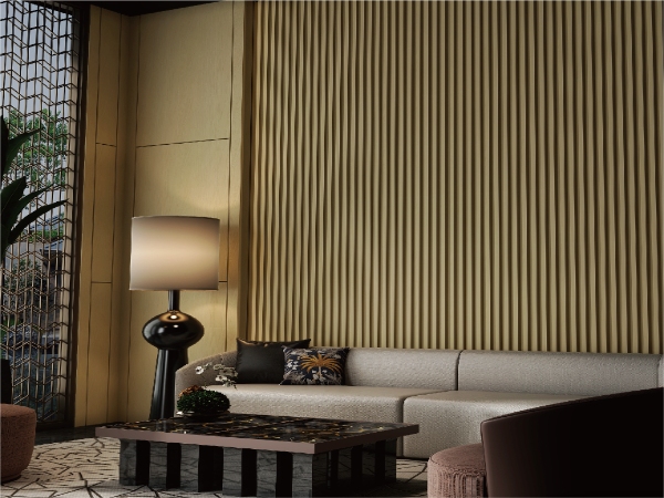
Mistake 3: Ignoring Lighting Direction
Fluted surfaces depend on lighting. This is one of the biggest design errors in fluted wall panel projects. It shows up especially when you compare photos to real life.
A fluted panel without good light can look flat. The same panel under strong overhead lighting can create uneven shadows. Then the wall feels striped rather than nice. This happens often on TV walls. Ceiling downlights create glare on the screen and odd shadow bands on the panel surface. It also happens in headboard design. The wall looks good during the day but dull at night because there is no soft side lighting. At reception desks, poor lighting can flatten the desk front. It weakens the first impression.
The Safer Lighting Logic
Use light to show the grooves. Do not use it to overpower them. Soft wall washing, hidden linear lighting, or carefully placed side light usually gives a cleaner result than strong central spotlights. For a bedroom headboard, warm indirect light is usually more comfortable than bright white overhead light. For a reception area, balanced front and side light helps the fluted texture stay visible from the entrance.
If a panel is picked only by color and texture sample without a lighting plan, the final wall often does not perform well.
Lighting fixed, now we look at keeping the TV wall from getting too crowded.
Mistake 4: Letting the TV Wall Become Too Busy
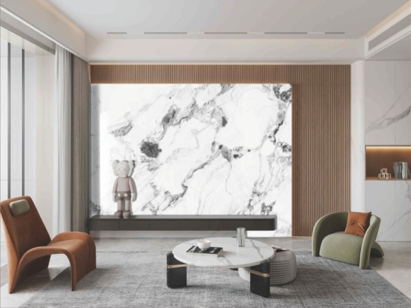
A fluted TV wall often fails because too many things fight for attention at once. The panel texture, the television, the media unit, decorative strips, stone accents, shelves, and LED lines all compete on one wall.
The result is not luxury. It makes your eyes tired.
A strong TV wall needs order. The screen is already a black rectangle that dominates the center. The fluted wall panel should support that look. It should not crowd it.
A Cleaner Planning Method
| Element | What often goes wrong | Better design move |
| TV screen | The wall texture is too strong behind it | Use a balanced panel pattern so the screen remains the main focus |
| Floating cabinet | Different finishes clash under the TV | Keep the lower cabinet simple and let the panel provide the texture |
| LED strips | Too many exposed lines and glowing edges | Use lighting only where it improves depth or function |
| Accessories | Shelves and decor overload the wall | Leave negative space so the fluted pattern can breathe |
This is especially important in small apartments, hotel rooms, and small lounges. In those spaces, holding back usually looks more costly than adding too many materials.
The TV wall is one thing. But bedrooms need a different touch.
Mistake 5: Treating a Headboard Wall Like a Living Room Feature Wall
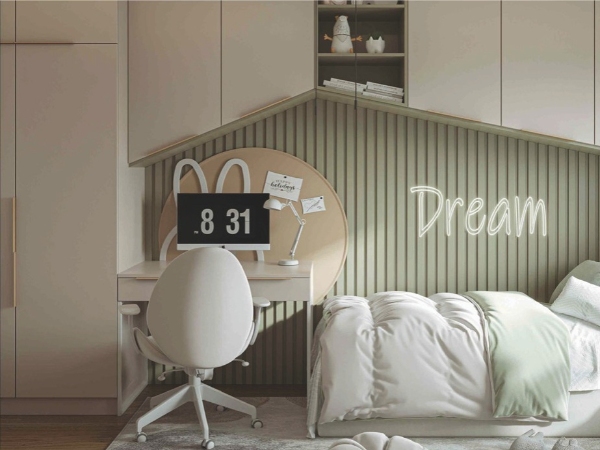
A bedroom is not a showroom and not a media room. Yet many headboard walls get designed as if they need the same strong impact as a living room statement wall.
That usually leads to stiff finishes, dark colors that take in too much light, or full-height panels with no softness around them. A fluted headboard wall should still feel restful. Texture is welcome. Hardness is not.
The best bedroom wall panel ideas usually balance linear texture with softer surrounding elements. These include fabric bedding, warm lighting, quiet wood tones, or simpler bedside furniture.
Where People Misjudge the Headboard Wall
One frequent mistake is stopping the panel exactly at mattress height. This can make the wall feel cut off. Another is taking the panel all the way across the room when only the bed zone needs focus. A third is forgetting bedside practicality. Sockets, switches, reading lights, and nightstands need to fit comfortably with the panel layout.
In real bedroom use, comfort always beats drama. A beautiful fluted wall panel behind the bed should support sleep. It should not control the whole room.
Edges are key too. They can make or break the finished look.
Mistake 6: Forgetting Edge Details and Transitions
This is the mistake that separates nice projects from average ones.
Fluted wall panels look clean from the front. But the edges, corners, returns, and transitions decide whether the installation feels complete. Poor trimming, awkward corners, exposed cut edges, and clumsy joins near ceilings or countertops are very common problems.
On reception desks, this is especially noticeable. The front face may look good. But if the side return is weak or the top transition is sudden, the desk loses trust. On TV walls, unfinished edges near door frames, stone slabs, or painted walls can make the entire feature wall feel cheap. In headboard applications, a panel that meets the ceiling or side wall without a proper stop detail can look incomplete.
The Practical Fix
Design the start point and end point before installation begins. The panel should not just stop where the wall ends. It should stop where the composition makes sense. That may mean a shadow gap, a slim trim, a wrapped corner, or a clean meeting line with another material.
Many interior projects fail not because the wall panel is wrong. They fail because the transition was never properly planned.
Finally, think about how the panel holds up over time.
Mistake 7: Choosing by Appearance Alone and Forgetting Daily Use
A fluted wall panel may look attractive in a sample board. But the real question is how it performs in the intended space.
TV walls deal with cable access, cleaning, and heat around electronics. Headboard walls deal with touch, dust, and the need for easy care. Reception desks face frequent contact, luggage bumps, shoes, bags, and daily cleaning. If the material choice ignores those realities, the wall may look good on day one and tired a few months later.
That is why buyers often look for interior wall panels that combine decorative value with straightforward maintenance and stable performance for indoor use. In busy residential and commercial environments, that balance matters.
A Short Note on Foshan Sincere Building Materials Co., Ltd.
For buyers sourcing WPC fluted wall panel solutions for interior projects, Foshan Sincere Building Materials Co., Ltd. is a supplier focused on indoor and outdoor wall and floor materials. This includes wall panels and indoor WPC fluted wall panels. The company states that it was established in 2007. It serves overseas markets across multiple regions. It highlights ISO9001, ISO14001, and ISO45001 certifications on its company profile. That background can be useful for importers, project buyers, and distributors looking for a WPC fluted wall panel supplier with export experience and a broader building materials portfolio.
Conclusion
A good fluted wall panel design is rarely about the panel alone. It comes from proportion, lighting, spacing, edge treatment, and a clear understanding of how the wall will actually be used. On a TV wall, the goal is a focused composition. On a headboard wall, the goal is warmth and calm. On a reception desk, the goal is a strong first impression that still stands up to daily traffic.
When those priorities are clear, fluted wall panels add depth without noise and texture without clutter. When they are ignored, the wall may still look trendy for a moment. But it will not feel right in the long term.
FAQs
Are fluted wall panels good for TV walls?
Yes, fluted wall panels work very well on TV walls when the scale is right and the layout is kept simple. The main mistake is making the wall too busy with extra shelves, lighting lines, and mixed materials.
Can a fluted wall panel be used behind a bed?
Yes. A fluted wall panel is a popular choice for a bedroom headboard wall because it adds texture without needing heavy decoration. Softer colors and balanced lighting usually work better in sleeping areas.
Do fluted wall panels suit reception desk design?
They do, especially in offices, showrooms, clinics, hotels, and retail spaces. A fluted wall panel can make a reception desk front look more custom and architectural. But edge finishing and durability matter a lot in high-traffic areas.
What is the biggest mistake with fluted panel design?
The biggest mistake is treating fluted wall panels like a decorative add-on instead of part of the full interior composition. Width, lighting, transitions, and surrounding furniture all affect the final look.
How do you make fluted wall panels look more expensive?
Keep the design controlled. Use the right wall width, avoid overcrowding, plan the lighting carefully, and finish all edges cleanly. In most cases, a simpler fluted wall panel layout looks more premium than an overdesigned one.
